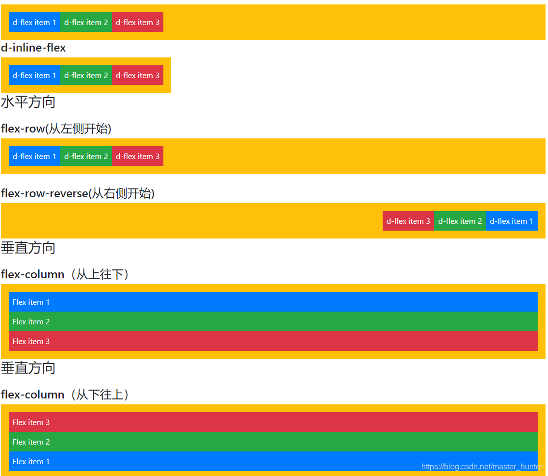
<!doctype html><html><head><meta charset="utf-8"><meta name="viewport" content="width=device-width, initial-scale=1, shrink-to-fit=no"><title>弹性盒子展示</title><link rel="stylesheet" href="bootstrap-4.2.1-dist/css/bootstrap.css"></head><body class="container"><h3 class="mb-4">定义弹性盒子</h3><h4>d-flex</h4><div class="d-flex p-3 bg-warning text-white"> <div class="p-2 bg-primary">d-flex item 1</div> <div class="p-2 bg-success">d-flex item 2</div> <div class="p-2 bg-danger">d-flex item 3</div></div> <h4>d-inline-flex</h4><div class="d-inline-flex p-3 bg-warning text-white "> <div class="p-2 bg-primary">d-flex item 1</div> <div class="p-2 bg-success">d-flex item 2</div> <div class="p-2 bg-danger">d-flex item 3</div></div><h3 class="mb-4">水平方向</h3><h4>flex-row(从左侧开始)</h4><div class="d-flex flex-row p-3 bg-warning text-white"> <div class="p-2 bg-primary">d-flex item 1</div> <div class="p-2 bg-success">d-flex item 2</div> <div class="p-2 bg-danger">d-flex item 3</div></div><br/><h4>flex-row-reverse(从右侧开始)</h4><div class="d-flex flex-row-reverse p-3 bg-warning text-white"> <div class="p-2 bg-primary">d-flex item 1</div> <div class="p-2 bg-success">d-flex item 2</div> <div class="p-2 bg-danger">d-flex item 3</div></div><h3 class="mb-4">垂直方向</h3><h4>flex-column(从上往下)</h4><div class="d-flex flex-column p-3 bg-warning text-white"> <div class="p-2 bg-primary">Flex item 1</div> <div class="p-2 bg-success">Flex item 2</div> <div class="p-2 bg-danger">Flex item 3</div></div><h3 class="mb-4">垂直方向</h3><h4>flex-column(从下往上)</h4><div class="d-flex flex-column-reverse p-3 bg-warning text-white"> <div class="p-2 bg-primary">Flex item 1</div> <div class="p-2 bg-success">Flex item 2</div> <div class="p-2 bg-danger">Flex item 3</div></div></body></html>
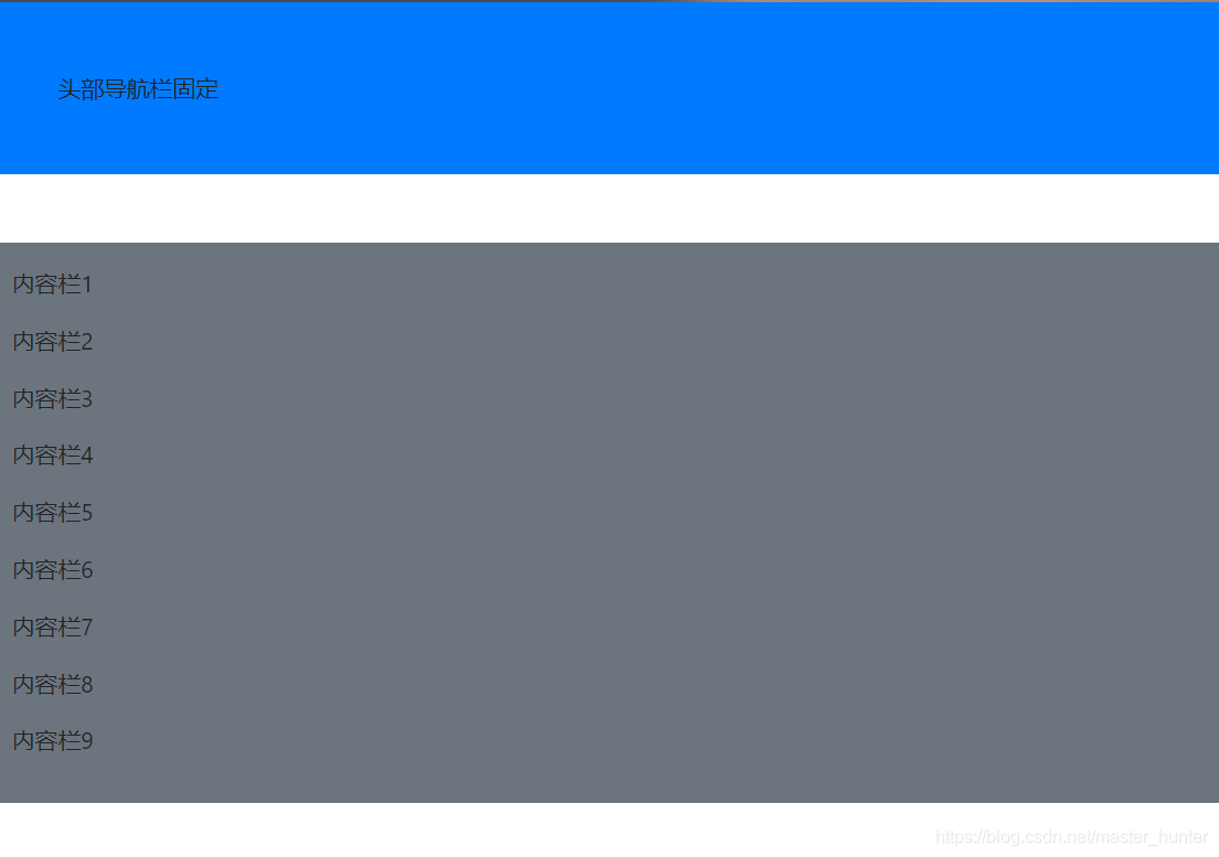
<!doctype html><html><head><meta http-equiv="Content-Type" content="text/html; charset=utf-8" /><meta name="viewport" content="width=device-width, initial-scale=1,shrink-to-fit=no" /><title>弹性盒子表单测试</title><link rel="stylesheet" href="bootstrap-4.2.1-dist/css/bootstrap.css" /><link rel="stylesheet" href="font-awesome-4.7.0/css/font-awesome.css" /></head><nav class="sticky-top bg-primary p-5 mb-5">头部导航栏固定</nav><div class="bg-secondary p-3"> <p>内容栏1</p> <p>内容栏2</p> <p>内容栏3</p> <p>内容栏4</p> <p>内容栏5</p> <p>内容栏6</p> <p>内容栏7</p> <p>内容栏8</p> <p>内容栏9</p></div><body></body></html>
<!doctype html><html xmlns="http://www.w3.org/1999/xhtml"><head><meta http-equiv="Content-Type" content="text/html; charset=utf-8" /><meta name="viewport" content="width=device-width, initial-scale=1,shrink-to-fit=no" /><title>带有导航栏的响应式网页档</title><link rel="stylesheet" href="bootstrap-4.2.1-dist/css/bootstrap.css" /><link rel="stylesheet" href="font-awesome-4.7.0/css/font-awesome.css" /></head><body class="container" style="height:2000px;"><div class="row"><div class="col-12 col-md-4 border py-3"> <nav class="sticky-top bg-primary p-5 mb-5"><a href="#topAnchor"><p class=" text-white">软件学院2020年活动</p></a></nav><nav class=" bg-danger p-3 "> <a href="#new1"><p class=" text-white">众星捧月美好时,举国欢庆悦团员</p></a><a href="#new2"><p class=" text-white one">学四史 铭初心 庆八秩芳华</p></a><a href=""><p class=" text-white">歌舞诠释活力,青春演绎精彩</p></a><a href=""><p class=" text-white">节俭始于心,"光盘"践于行</p></a><a href=""><p class=" text-white">“迎国庆庆中秋 从瑶湖再出发”拔河比赛</p></a><a href=""><p class=" text-white">软件学院学生同上一堂思政大课</p></a><a href=""><p class=" text-white">毕业季 |致敬我们的四年</p></a><a href=""><p class=" text-white">软件学院组织举办"垃圾分类"主题教育</p></a><a href=""><p class=" text-white">前方高能!直击超燃现场!</p></a><a href=""><p class=" text-white">青山湖校区“奋进2020”元旦文艺晚会</p></a><a href=""><p class=" text-white">有爱师大!你的专属月饼已送达~</p></a><a href=""><p class=" text-white">校党委委员、副校长深入软件学院开展“双体验日”活动</p></a><a href=""><p class=" text-white">关于举办软件学院“学四史 铭初心 庆八秩芳华”网页设计制作大赛的通知</p></a> </nav></div><div class="col-12 col-md-8 border py-3"><div id="topAnchor"></div> <div id="new1" class="d-flex flex-column p-3"> <h3 align="center">众星捧月美好时,举国欢庆悦团员</h3> <p >佳节将至,或难团圆。希望这份月饼可以陪伴,每一位师大学子。家在远方,你在师大心上。此心安处,便是师大。</p> <a><img src="1.png"></a></div> <div id="new2" class="d-flex flex-column p-3"> <h3 align="center">“迎国庆庆中秋 从瑶湖再出发”拔河比赛</h3> <p>10月1日上午,2020级新生在篮球场举行“迎国庆庆中秋 从瑶湖再出发”拔河比赛。参加此次拔河比赛的学院有软件学院,音乐学院和体育学院。现场氛围十分热烈,快随小编一起来看看吧~</p> <a><img src="2.png"></a> </div> </div> </div></body></html>


苏公网安备 32132202001088号
| Copyright 北极熊 北格技术 版权所有

